
People rarely arrive on a landing page with time to spare. They have a question, a problem, or a goal, and they want a clear reason to keep scrolling. Every headline, button, image, and section shapes that decision within seconds.
A well-designed landing page guides visitors toward the next step with confidence and removes anything that slows them down. Strong landing page design comes from thoughtful choices backed by user behavior, testing, and clear communication, all of which contribute to a better landing page experience Small improvements often lead to higher conversion rates because they make the experience faster, simpler, and easier to understand.
This post covers practical landing page design tactics that encourage more clicks, sign-ups, and purchases. You’ll learn which elements deserve the most attention, why they matter, and how to refine them to create pages that consistently turn more visitors into customers.
Make Your Value Proposition Immediately Clear
Visitors decide whether to stay or leave within moments, so your landing page should answer one question immediately: “What do I get here?” A clear value proposition gives people the answer before they have to search for it.
Research also shows that companies whose value proposition stays clear and consistently understood across customer touchpoints grow 1.6 times faster than the average business. That makes clarity a practical growth strategy instead of a simple writing exercise.
To put this into practice:
- Craft a headline that explains your primary benefit in plain language.
- Skip clever phrases that force visitors to interpret your message and instead improve content readability through plain, direct language.
- Follow the headline with a short paragraph that explains who your product or service helps and why it’s useful.
- Place a strong CTA nearby so people know exactly what to do next.
- Support your message with visuals that match your offer instead of generic stock images.
- Add trust signals, including customer reviews, certifications, recognizable client logos, or performance statistics, where they naturally reinforce your claims.
- Review every section and remove anything that distracts from the main promise.
Here’s an example of this approach by an established brand:
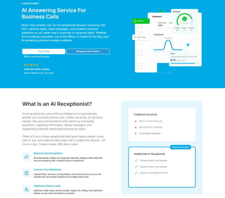
DialMyCalls, a platform that helps organizations send mass text messages and automated communications, applies this on its landing page for its AI answering service.
The page opens with a benefit-focused headline, supporting copy, product visuals, trust signals, and highly visible CTAs that explain the service before asking visitors to convert. Right after that, it introduces an educational section titled “What Is an AI Receptionist?” The placement answers the most common follow-up question exactly when visitors are likely to ask it.
This keeps the experience informative while maintaining momentum toward the next step, creating a smoother path from initial interest to conversion.
Source: dialmycalls.com
Use Landing Pages to Sell the Outcome, Not Just the Product
People rarely make decisions because of features alone. They respond to the result they expect after choosing your product or service.
A landing page becomes more persuasive when it helps visitors imagine solving a problem, reaching a goal, or enjoying a better experience. That improvement creates an emotional connection while giving every feature a clear purpose within the buying journey.
To achieve this on your own pages:
- Outline the main outcome your audience wants instead of listing everything your offer includes.
- Build your headline around that result, then support it with concise copy explaining how your product helps people achieve it.
- Use visuals that reflect the desired experience instead of focusing only on product screenshots or technical details.
- Include testimonials that describe measurable improvements or positive changes customers experienced after purchasing.
- Organize your page so every section reinforces the same outcome through benefits, examples, and clear CTAs.
- Keep technical specifications available for interested visitors, but present them after you’ve established why the final result matters.
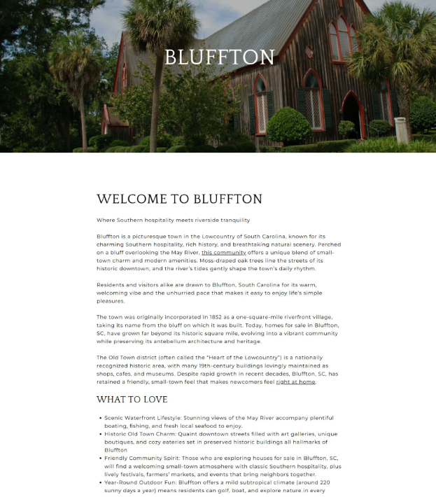
John Campbell, a real estate professional specializing in residential properties, demonstrates this strategy on a landing page featuring homes in Bluffton, South Carolina.
Instead of leading with property listings or market data, the page welcomes visitors with immersive imagery and descriptive storytelling that captures the area’s atmosphere, lifestyle, and everyday appeal. Readers can picture morning walks, waterfront views, welcoming neighborhoods, and the pace of daily life before they encounter available homes.
Bluffton itself becomes the strongest selling point because visitors first connect with the experience of living there. Once that interest develops, the page naturally introduces real estate opportunities that support the lifestyle already presented.
This sequence creates stronger motivation by encouraging visitors to pursue the outcome they want before evaluating the available properties.
Source: johnsellshiltonhead.com
Guide Visitors Through Complex Decisions One Step at a Time
Some purchases involve multiple options, unfamiliar terms, or important personal considerations. When visitors face too many choices at once, they often delay their decision or leave the page altogether.
A well-structured landing page reduces that friction by presenting information in a logical sequence. Each section should answer one question, prepare visitors for the next step, and steadily move them toward a confident decision without creating unnecessary mental effort.
To apply this:
- Recognize the key questions customers ask before making a purchase.
- Arrange your content so each section addresses one of those questions in a natural order.
- Introduce the problem first, explain your solution, highlight important features, provide supporting evidence, and finish with a clear CTA.
- Break large blocks of information into short sections with descriptive headings that make scanning easier.
- Use comparison tables, visual indicators, or recommended options to simplify decisions when multiple choices are available.
- Keep forms short and ask only for information you genuinely need.
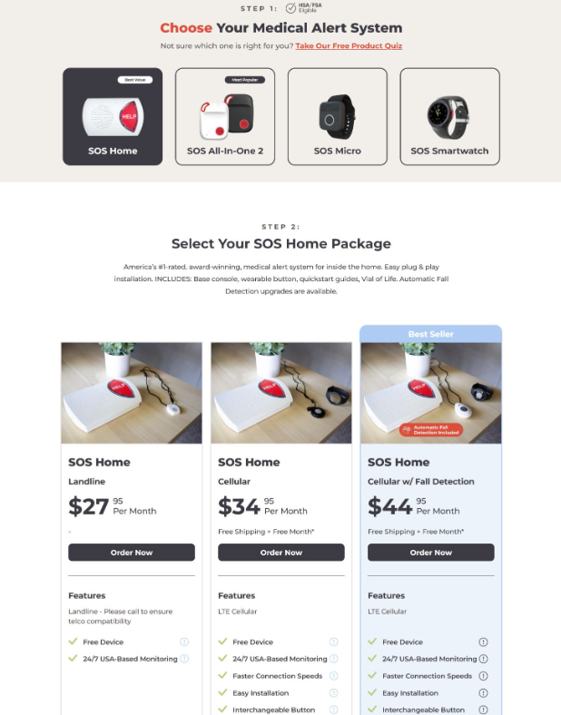
Bay Alarm Medical, a company selling medical alert systems, demonstrates this strategy effectively on its pricing page.
Instead of presenting every plan with equal emphasis, the page organizes the buying process into simple, sequential steps that help visitors evaluate their options without feeling overwhelmed. Recommended plans and best-value selections receive clear visual emphasis, making it easier for customers to narrow their choices quickly.
The layout also groups related information together, allowing visitors to compare features, understand pricing, and identify the right solution before moving forward.
By guiding users through each decision in a structured order, the page creates a smoother buying experience that reduces hesitation and encourages more confident conversions while keeping the selection process straightforward from beginning to end.
Source: bayalarmmedical.com
Build Confidence by Demonstrating Expertise Throughout the Landing Page
Visitors look for evidence before they commit to a purchase, book a consultation, or share their contact details. They want proof that you understand their situation and can deliver the promised result.
Research supports that behavior, with 73% of customers abandoning content within 30 seconds if it lacks substance or practical application, highlighting the importance of well-structured content. A landing page packed with useful information, relevant examples, and clear guidance gives people a stronger reason to stay and continue exploring.
To build this into your own page:
- Show your expertise through every section instead of relying on a single credentials block.
- Answer common questions before visitors have to ask them, and explain your process in simple language.
- Include practical insights that help readers understand their options, even if they haven’t decided to buy yet.
- Add customer testimonials that highlight specific results rather than generic praise.
- Support your claims with certifications, awards, years of experience, case studies, or relevant statistics whenever possible.
- Keep the content focused on solving real problems instead of promoting your business.
- Structure the page with clear headings so visitors can quickly find the information they need, and place your CTA after you’ve built enough confidence to encourage the next step.
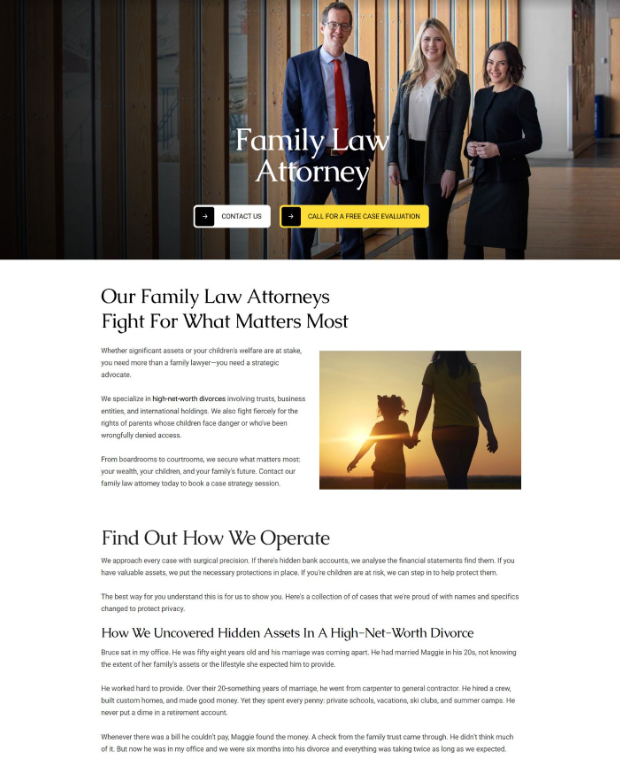
Freeburg Law, a firm representing clients in personal injury and criminal defense matters, applies this approach effectively on its family law attorney landing page.
The page presents straightforward service information alongside educational content that explains legal issues in accessible language. Real-world examples help visitors understand how different family law situations may unfold, while reassuring visuals create a welcoming and professional atmosphere.
Each section answers common concerns that potential clients often have before contacting a lawyer, reducing uncertainty throughout the experience.
This way, clients gain confidence in the firm’s knowledge before reaching the contact form, creating a smoother path toward making an inquiry.
Source: tetonattorney.com
Create Momentum by Giving Every Section a Clear Purpose
A landing page works best when each section earns its place. Visitors should always understand why they are seeing a specific message, image, proof point, or CTA.
Randomly arranged content creates confusion, while a purposeful organized content structure keeps attention focused and helps people move naturally toward conversion.
To implement this discipline:
- Define the goal of every section before writing or designing it.
- Your opening section should introduce the main value, while later sections can explain features, address concerns, provide proof, and encourage action.
- Avoid adding information simply because it sounds useful.
- Ask whether each element helps visitors understand the offer, trust the brand, or make a decision.
- Use clear transitions between sections so the page feels like a connected experience.
- Review the entire page after completion and check whether every part supports the main conversion goal.
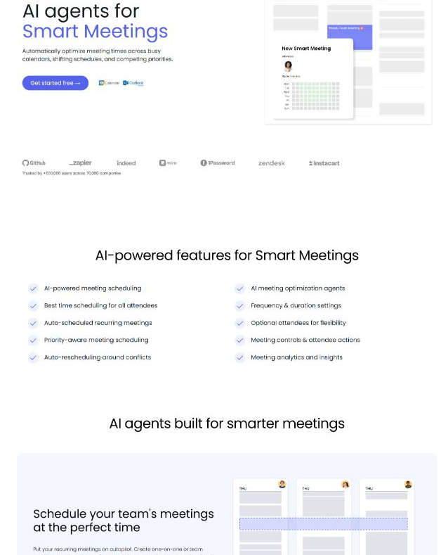
Reclaim, a platform for managing calendars, scheduling tasks, and organizing work, uses this approach effectively on its AI-powered smart meetings landing page.
The page follows a clear progression where each section serves a specific purpose. It begins with a focused value proposition, then introduces features and capabilities that explain the product’s benefits. After that, it highlights performance metrics and clear numbers, presents additional features from the broader platform, and includes customer testimonials to strengthen trust.
This structure gives visitors the information they need at the right stage of their decision process. By assigning a clear role to every section, you can create a focused journey that keeps users engaged and moves them closer to taking action with less hesitation and greater clarity.
Source: reclaim.ai
Design Every CTA to Feel Like the Natural Next Step
A call to action should never feel like an ambush. When a button screams “Buy Now” before a visitor understands what they’re buying, the natural response is suspicion. A well-designed CTA arrives at the exact moment someone thinks, “I want to learn more” or “This sounds like what I need.”
The right CTA at the right stage can increase conversion rates by up to 47%. That number reflects something powerful: People want to say yes when the invitation matches their readiness.
Forcing a commitment too early feels pushy. Waiting too long wastes momentum. The sweet spot sits inside the natural rhythm of your page.
To implement context-sensitive CTAs:
- Match their language with the visitor’s intent.
- Early sections may need softer actions like learning more or exploring options, while later sections can encourage sign-ups or purchases.
- Use specific wording that explains the value instead of generic phrases that create doubt.
- Place CTAs after key moments of interest, such as after explaining a benefit, showing proof, or answering a common concern.
- Test different placements, messages, and designs to discover which combinations help visitors move forward more easily.
- Keep the number of choices limited so visitors can focus on the most relevant option without feeling overwhelmed by competing actions across the page. That way, the overall experience remains simple and focused throughout the entire decision process for users.
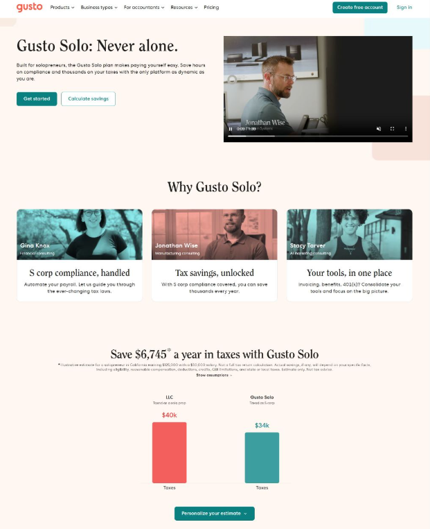
Gusto, a cloud-based platform that helps businesses manage payroll, HR, and employee benefits, applies this tactic on its solopreneur-focused landing page.
The page uses CTAs that fit each section’s purpose and visitor mindset. The navigation menu includes “Create a free account,” while the header presents “Get started” and “Calculate savings.” A section about saving taxes guides users toward “Personalize your estimate,” then transitions into service details and pricing before ending with another “Get started” CTA.
Each CTA fits its surrounding content instead of repeating one generic ask throughout the page.
Source: gusto.com
Final Thoughts
Effective landing pages guide visitors with clarity, purpose, and confidence. Every element plays a role, from the first headline to the final CTA. Clear value propositions, outcome-focused messaging, expert content, structured decision paths, purposeful sections, and relevant CTAs help visitors understand your offer and take the next step.
Improving a landing page doesn’t require changing everything at once. Focus on removing friction, answering visitor questions, and creating a smoother experience from start to finish. When each part of the page supports the customer journey, your landing page becomes a stronger tool for turning interest into action.